The origins of web-brutalism
Web-brutalism is a design trend rooted in architecture and digital art. In the context of architecture, brutalism refers to a style of building that was popular between 1960 and 1980. Houses were defined by their geometric shapes and the use of raw concrete as a main construction material. Brutalism is defined by it’s unfinished look and lack of frills and decoration. In this aspect it’s related to minimalism.In the middle of the 2010s–when the information age started to transform into the innovation age–brutalism was applied to websites. It was around that time, that mobile and wearable devices started to become products of fashion and an important part of our lifestyle. At the same time online based services and more specifically services that are focused on mobile devices became widely accepted.
The establishment of wearables and mobile devices paved the way for certain services
To be successful, new ideas need to be in coordination with existing services around them. On top of that the majority of those services are either owned or dominated by a small number of big companies such as Google or Apple.
The degree of standardization also increases further since many of the big companies that offer some kind of digital service make their style guides and design recommendations openly accessible to anybody. As a consequence these guidelines start to dominate the market: people try to build products that integrate seamlessly with those of the big software providers and people who don’t have a lot of experience with design can follow those guides and as a result get something acceptable.
While the movement of web-brutalism didn’t start intentionally, but rather emerged by chance as something that multiple designers did independently of each other, it still poses as a counter-movement to this increasing standardization. Brutalism in its original sense refers to design that is raw, unpolished and not made to look pretty but instead focuses on the material it was made from. Brutalist websites often appear odd-looking, straight-forward and reminiscent of the punk movement and abstract art. Sometimes they are also described as harsh, stripped-down designs that have no frills.
What is the goal of brutalism?
Brutalism is defined by its lack of concern to make interfaces look pleasant, easy or comfortable to use. Brutalists are trying to make the designers of digital products’ user interfaces come out of their comfort zone and try something new. By no means is brutalism a tool that can easily be used in UX design but it’s nevertheless interesting to know about.
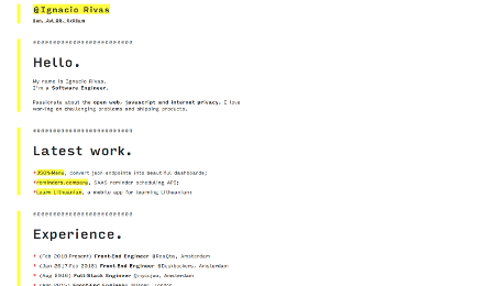
Example of a brutalist website using a clear structure by Ignacio Rivas
Critics of today’s UX design standards sometimes state that “user experience is everyone’s ultimate pretext for their lack of originality and diversity”. Usually web-brutalism completely ignores principles of user centered design to make a statement. Sometimes it is even used as a kind of inside joke between UX professionals, designers and related groups.
Some designers even believe that brutalism aims to intentionally create ugly designs and disorienting, complex interfaces using harsh colors, disorienting patterns, distracting animations, weird cursors and a lack of visual hierarchy. This is not necessarily the case (Nielsen and Norman refer to this kind of design as “antidesign”). In fact brutalism can be used as a way to prioritize function over form-which can lead to an increase in usability.
In any case, antidesign and brutalism are interesting to look at and will likely capture your users’ attention. However you should carefully consider whether brutalism is the right tool to attract attention. Unless you want to entertain a group consisting exclusively of UX professionals by using brutalism as a joke, you risk confusing your users. After all not everything that is designed with usability in mind and simple to use is necessarily boring.


 in Germany
Comments are closed.